
By Jenny Ozbirn
Instructional Partner
Florence City (AL) Schools
Sometimes complete understanding of student data warrants more than a departmental discussion in order for a faculty to feel ownership and responsibility for the whole.
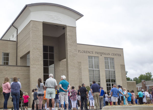
At the Florence Freshman Center, we are concerned about the students who are failing core classes and recognize the dire need to work together to weave a safety net that we all can feel good about. In order to begin this process, it was important to see the big picture.
The concept I’m describing here is a work in progress, but I have high hopes that it will prove to be beneficial. Knowledge is power, and sometimes going back to the drawing board to physically graph things is what needs to happen for people to see the possibilities.
Data’s what we’re talking about…
Here are the steps we are taking to help our kids (and each other):
- Last semester I compiled charts for the faculty illustrating each child that failed a core class for the first nine weeks.
- During our first data day after the first semester, teachers walked up as a group, plotted the students’ semester grades, and x’d out the class if the result ended up to be a passing grade.
- If a student improved and passed every class he or she was failing, his or her name was x’d out. (Hooray!)
- We placed color-coded stars by the names of students who were identified as having failed three or more core classes in the eighth grade and also those students repeating the ninth grade.
- A blank chart was created where teachers added names of this year’s freshman students who had failed the semester, but had not been failing at the halfway mark. (Eww.)
- We took some time to look at the charts with our colleagues and have some strong conversations about the students and observable trends. The dynamics of student/teacher relationships differ from person to person, so the various perspectives proved especially valuable. Taking it from the numbers to the people helped all of us to see the big picture.
- We broke into departments and brainstormed strategies to eliminate as many of the names from these charts as possible.
- We then compiled these strategies onto big sheets of paper, making checkmarks by those strategies suggested more than once.
- We now have a list of agreed-upon strategies to either revamp or begin trying.
- These charts are posted in the PD room as a reminder of the work we have to do. We are looking forward to implementing the necessary strategies that will help allow those names to move to a happier, passing place.
What we’re learning so far
The most beneficial outcome so far has been the kind of conversations the visual representation of data is promoting. We read the names, but we see the faces, and we talk about the people.
This kind of work with data is not something we are used to at the secondary level, considering how we are just beginning to get used to the culture of sharing and opening the doors to our own classrooms.
My principal Mr. Rod Sheppard and I went to Weeden Elementary in our district and collaborated with their principal and their instructional partner, Dr. Joey Dawson and Amy Donnelly. Seeing how they use their data opened our eyes in many ways, and proved to us that we can find great ideas right down the street. And not just in high schools.
I look forward to seeing how this turns out. Please click on the image above if you would like to see what this process looked like. I made this presentation with the app Adobe Voice. Easy Peazy. Thanks for reading!
Jenny Ozbirn is the Instructional Partner at the Florence City (AL) Freshman Center. She has been an educator for 22 years, including 19 years in the classroom teaching English 9, 10, 12, and German. This is her third year in a coaching role. Jenny holds a BSEd (English and German 7-12) and Master’s Degree (English 7-12) from the University of North Alabama.

